 November 11, 2026
Why I Think Reading Should Feel Like an Experience, Not a Task
Somewhere along the way, reading seems to have become another activity people are encouraged to measure. How many books have you finished?…
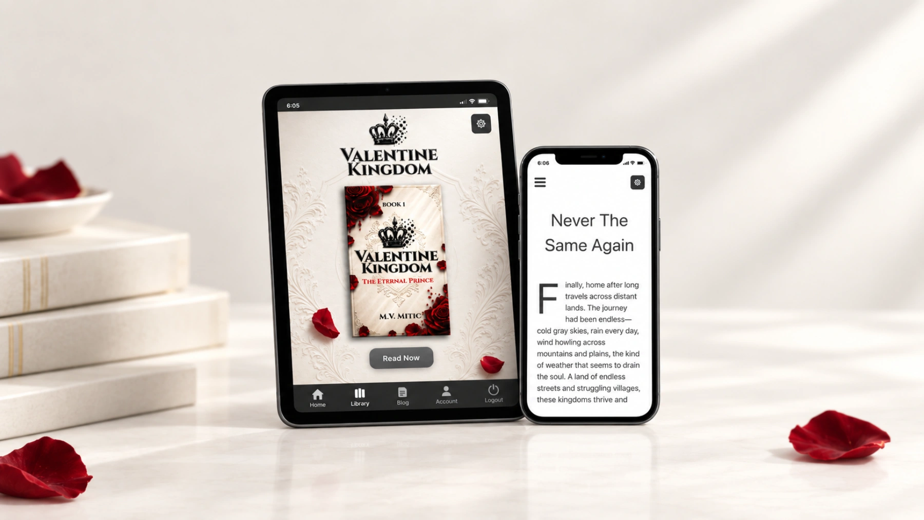
Valentine Kingdom was never meant to exist only as a book sitting on a shelf. As the world began to grow, I wanted readers to have one simple place where they could return to it, open their library and start reading without having to think about where everything was stored. A book might introduce someone to the story, but I wanted the experience of returning to that world to be just as convenient as discovering it for the first time.
That became the idea behind the Valentine Kingdom app and reading experience. Rather than creating an entirely separate digital product, I wanted the website, reader and personal library to work together. Someone discovering The Eternal Prince could begin reading through the website, create an account when needed and return to the same library whenever they wanted to continue.
The goal was never to build something filled with features simply because they could be added. I wanted the technology to stay in the background and leave the book where it belongs — at the center. A reading application should make it easier to enjoy a story, not give readers another complicated system to learn.
After signing in, readers can enter their personal library and access the books available to them. The library acts as a central place for the reading experience, so there is no need to search through old messages or move between different services whenever someone wants to return to a book.
The library itself is intentionally simple. There are no enormous menus to work through or unnecessary sections competing for attention. The purpose is to make available books easy to find and open, with a familiar environment waiting whenever readers return. I think this kind of simplicity becomes especially valuable when someone has not visited a website for several weeks and simply wants to continue reading.
Right now, that library may be small. Valentine Kingdom is only at the beginning, and The Eternal Prince introduces the first part of a much larger series. However, the library was designed with the future in mind, allowing additional books and reading experiences to become part of the same environment as they are released.
I like the idea that someone can discover the first story today and return years later to find a library that has grown alongside Valentine Kingdom. Their original account remains a familiar entry point rather than becoming something that belongs only to the first release. For me, that continuity is an important advantage of developing a reading platform around an entire series instead of treating each book as an unrelated product.
Most people carry their phones everywhere, so the reading experience was designed with mobile devices in mind. Someone might have a few quiet minutes during the day or prefer spending an entire evening reading. In either situation, opening a chapter should feel comfortable without requiring the reader to adjust to a complicated interface.
Instead of turning the book into one enormous webpage, the reading experience organizes the story into chapters and manageable pages. This allows readers to move through the narrative in a way that feels closer to reading a book rather than scrolling endlessly through a traditional website. The distinction matters to me because a story should have a natural rhythm, and the interface should support that rhythm rather than interrupt it.
Typography is another important consideration. A comfortable reading experience depends on more than simply displaying words on a screen. Text size, spacing, contrast and the width of the reading area all influence how pleasant a chapter feels, particularly during longer sessions. I wanted readers to have an environment where the writing remains clear and the surrounding interface does not compete with it.
The reader also offers appearance and text preferences, allowing people to choose a presentation that suits their reading habits. Some prefer a bright page, while others find a darker background more comfortable. These are relatively small details, but I think they make a meaningful difference because no single reading style works equally well for everyone.
One of the challenges of building a digital reader is deciding how much navigation should remain visible. Readers need a way to move between chapters, find their place and adjust settings, but displaying every available control at once can make the page unnecessarily crowded.
I prefer an approach where those functions remain accessible without dominating the reading area. The story should occupy most of the screen, while navigation and settings appear when the reader needs them. This creates a clearer distinction between reading and managing the reading experience.
Chapter navigation is particularly useful when someone wants to revisit an earlier part of the story. A reader may remember an important conversation, want to check a detail or simply enjoy returning to a favourite chapter. Having an organized contents section makes those actions easier than searching through a long collection of text.
I also wanted the transition between pages to feel straightforward. Whether someone is using a phone, tablet or computer, moving forward through a chapter should not require unnecessary effort. The best reading controls are often the ones people stop noticing because they behave as expected.
The Valentine Kingdom reading experience can also be installed directly from the website on supported devices and browsers. Once installed, it can appear alongside other applications while continuing to use the same website, account and library.
That was important to me because I did not want to create two separate versions of Valentine Kingdom that readers would have to understand independently. A person might discover the story through a browser on their computer and later decide that opening it from their phone’s home screen is more convenient. Both methods should lead back to the same familiar reading environment.
This approach also allows the website to remain the central part of the experience. Articles, book information and other public content can introduce visitors to Valentine Kingdom, while the library provides a more personal space for reading. The installed app is another way to reach that environment, not a replacement for the website itself.
I think this is a useful balance for a developing series. Readers do not need to install something before discovering what the books are about, but the option is available for those who prefer having a more direct way to return. The choice belongs to the reader rather than being imposed as a requirement.
Having a personal account creates a connection between the different parts of Valentine Kingdom. Instead of treating every visit as a completely new experience, readers can sign in and return to the books associated with their library.
This becomes particularly useful as additional titles are released. Someone who has already discovered the series does not need to establish an entirely new relationship with a different reading service each time another book becomes available. The existing library can remain the place where their reading collection develops.
I also wanted to keep the process of accessing purchased books straightforward. After a purchase is confirmed, the corresponding reading access becomes available through the library. The intention is to make the transition from discovering a book to reading it as simple as possible, without sending readers through several unrelated platforms.
Of course, accounts introduce responsibilities as well. Login pages, access permissions and purchase records need to work reliably because they form part of the reader’s experience. These details may not be particularly exciting from the outside, but they matter when someone simply wants to open a book they have already purchased.
For me, the account system is not meant to become a social network or a complicated membership platform. Its primary purpose is to provide a consistent and convenient way to access the stories.
People read in different circumstances, and I wanted Valentine Kingdom to accommodate that variety. A desktop computer may provide a larger, quieter reading area, while a phone is often more convenient when travelling or spending time away from home. Tablets offer another option for readers who prefer a screen closer to the size of a traditional book.
The layout therefore needs to adapt without losing its basic identity. Text should remain readable, navigation should stay accessible and the page should not become unnecessarily complicated simply because the available screen is smaller. I think consistency matters because someone familiar with the reader on one device should recognize the experience on another.
There are also practical differences between reading on a website and reading inside a dedicated reading interface. A traditional article usually encourages scrolling, while a book often benefits from a more contained presentation. I wanted the reader to reflect that distinction, giving chapters their own space rather than making the entire story resemble a collection of ordinary blog posts.
The underlying goal remains the same on every device: make it easy to concentrate on the writing. Readers should be able to choose whichever screen suits their circumstances without feeling that they are using an entirely different product.
While developing the reading experience, I kept returning to one question: does this actually make reading better? It is easy to imagine additional controls, animations, menus and features, especially when working on a digital product that can be changed over time. However, the ability to add something does not automatically mean that it belongs in the finished application.
Every additional feature creates another element for readers to understand. It may also introduce more maintenance, additional settings or unexpected problems. I would rather keep the foundation simple and improve the parts people actually use than fill the interface with functions that contribute little to the reading experience.
This does not mean Valentine Kingdom will remain exactly as it is today. The books, website and reader can continue developing as the series grows. Some improvements may involve small adjustments to navigation or typography, while others may eventually introduce new ways of experiencing the stories.
I simply prefer those changes to have a clear purpose. If an addition makes reading easier, more comfortable or more accessible, it deserves consideration. If it mainly makes the application appear more complicated, I would rather leave it out.
One reason I wanted a central library from the beginning was the possibility of expanding the collection over time. The Eternal Prince is the first book in Valentine Kingdom, but the larger world provides room for additional stories, characters and experiences.
Each future release can become part of the same reading environment. Readers familiar with the first book will already know where to return, while new visitors can discover the collection as it develops. The library therefore becomes more valuable as additional titles become available, without needing to change its fundamental purpose.
This also makes the relationship between the website and the books more useful. Public articles can introduce aspects of the world, discuss the writing process or provide information about upcoming releases. The library, meanwhile, remains focused on the reading experience itself. Keeping those purposes distinct helps prevent the interface from becoming crowded.
I also like the possibility of readers discovering Valentine Kingdom at different stages of its development. Someone may begin with the first book shortly after release, while another person might discover the series when several titles are already available. Both should be able to find their way into the story without needing to understand how the website developed over the years.
The app, library, website and everything built around them exist for one reason: the stories. They are ways of making Valentine Kingdom easier to discover, access and enjoy, but none of them should become more important than the books themselves.
I think a successful reading experience is one that gradually disappears from the reader’s attention. Once a chapter is open, the interface should feel familiar enough that the reader can concentrate on the characters, their decisions and the world unfolding around them. That is far more important to me than the number of features an application can advertise.
As Valentine Kingdom grows, I expect the technology surrounding it to develop as well. There may be new books, additional reading options and improvements that make returning to the series even more convenient. However, I want that growth to follow the needs of the stories and their readers rather than turning the library into something unnecessarily complicated.
For now, the foundation remains straightforward: create an account, enter the library, choose a book and begin reading. The intention is to make Valentine Kingdom a familiar place to return to, whether someone is discovering Alexander’s journey for the first time or continuing a story they already know.
There will be much more to come.
November 11, 2026Somewhere along the way, reading seems to have become another activity people are encouraged to measure. How many books have you finished?…
 November 11, 2026
People often talk about reading goals as though finishing more books automatically means becoming a better reader. Read fifty books this year,…
 November 11, 2026
Digital reading has made books more accessible than ever. We can carry entire libraries on our phones, purchase ebooks almost instantly and…
 November 11, 2026
Have you ever noticed how much easier it is to enjoy a book when your surroundings feel comfortable? I think the environment…
 November 11, 2026
The beginning of a new year often creates pressure to make ambitious resolutions. Write an entire novel, publish several books, build a…
 November 11, 2026
Christmas attracts enormous attention from retailers, publishers and businesses offering seasonal promotions. Throughout December, customers encounter discounted products, gift recommendations and advertisements…
 November 11, 2026
Holiday travel often involves packing more things than expected. Clothes, gifts, personal belongings and everything else compete for limited space. Whether somebody…
 November 11, 2026
December seems like an attractive month to release a book. People are shopping for Christmas gifts, spending more time indoors and looking…
 November 11, 2026
Every winter, online stores begin advertising seasonal discounts, limited-time offers and holiday promotions. Books are no exception. A lower price can make…
 November 11, 2026
Holiday shopping has become increasingly dominated by electronics, subscriptions and products that often disappear from attention shortly after they are purchased. Every…
November 11, 2026Somewhere along the way, reading seems to have become another activity people are encouraged to measure. How many books have you finished?…
November 11, 2026People often talk about reading goals as though finishing more books automatically means becoming a better reader. Read fifty books this year,…
November 11, 2026Digital reading has made books more accessible than ever. We can carry entire libraries on our phones, purchase ebooks almost instantly and…
November 11, 2026Have you ever noticed how much easier it is to enjoy a book when your surroundings feel comfortable? I think the environment…
November 11, 2026The beginning of a new year often creates pressure to make ambitious resolutions. Write an entire novel, publish several books, build a…
November 11, 2026Christmas attracts enormous attention from retailers, publishers and businesses offering seasonal promotions. Throughout December, customers encounter discounted products, gift recommendations and advertisements…
November 11, 2026Holiday travel often involves packing more things than expected. Clothes, gifts, personal belongings and everything else compete for limited space. Whether somebody…
November 11, 2026December seems like an attractive month to release a book. People are shopping for Christmas gifts, spending more time indoors and looking…
November 11, 2026Every winter, online stores begin advertising seasonal discounts, limited-time offers and holiday promotions. Books are no exception. A lower price can make…
November 11, 2026Holiday shopping has become increasingly dominated by electronics, subscriptions and products that often disappear from attention shortly after they are purchased. Every…
November 11, 2026Somewhere along the way, reading seems to have become another activity people are encouraged to measure. How many books have you finished?…
November 11, 2026People often talk about reading goals as though finishing more books automatically means becoming a better reader. Read fifty books this year,…
November 11, 2026Digital reading has made books more accessible than ever. We can carry entire libraries on our phones, purchase ebooks almost instantly and…
November 11, 2026Have you ever noticed how much easier it is to enjoy a book when your surroundings feel comfortable? I think the environment…
November 11, 2026The beginning of a new year often creates pressure to make ambitious resolutions. Write an entire novel, publish several books, build a…
November 11, 2026Christmas attracts enormous attention from retailers, publishers and businesses offering seasonal promotions. Throughout December, customers encounter discounted products, gift recommendations and advertisements…
November 11, 2026Holiday travel often involves packing more things than expected. Clothes, gifts, personal belongings and everything else compete for limited space. Whether somebody…
November 11, 2026December seems like an attractive month to release a book. People are shopping for Christmas gifts, spending more time indoors and looking…
November 11, 2026Every winter, online stores begin advertising seasonal discounts, limited-time offers and holiday promotions. Books are no exception. A lower price can make…
November 11, 2026Holiday shopping has become increasingly dominated by electronics, subscriptions and products that often disappear from attention shortly after they are purchased. Every…

Add the M.V. Mitic app to your device and start reading.