 October 25, 2026
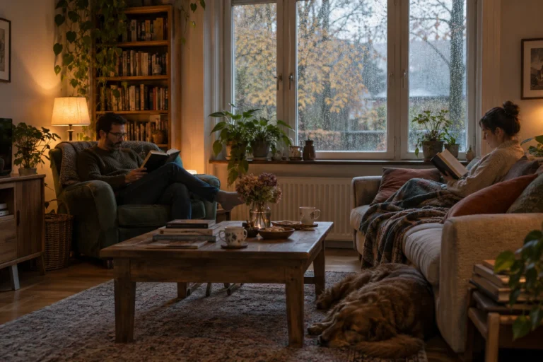
A Halloween Reading Night for Two
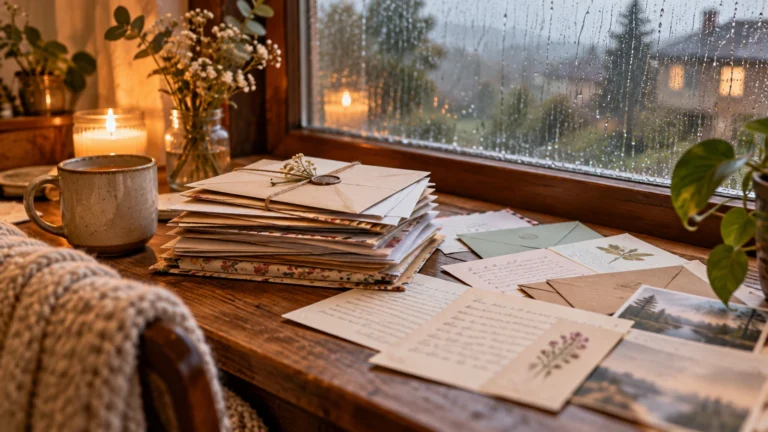
A reading night for two sounds like a good Halloween plan to me because it leaves room for both company and quiet.…
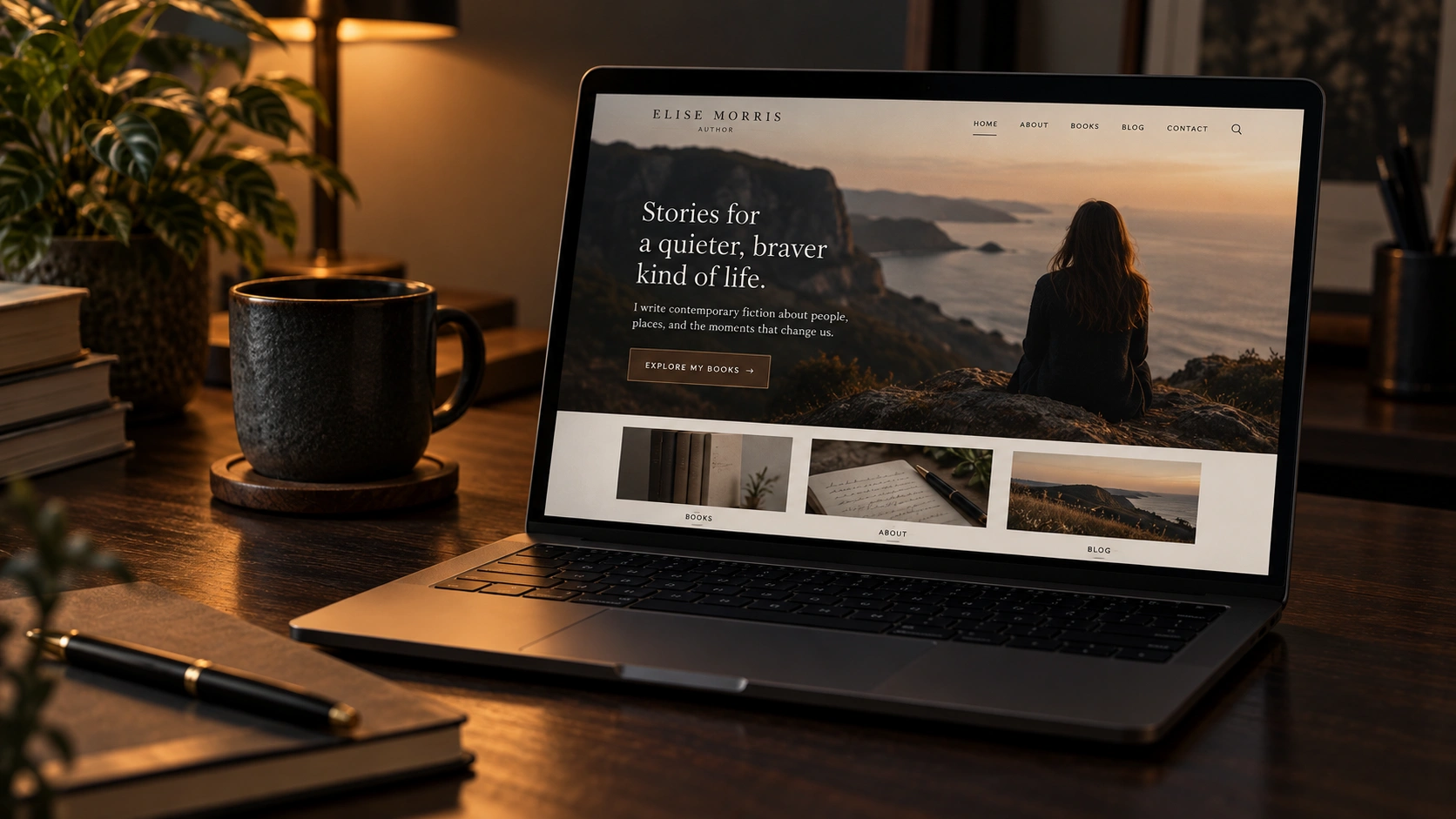
I do not think an author website needs to look expensive to look professional.
Actually, I think websites sometimes start looking worse when too many things are added. Too many colors, effects, buttons and sections can make everything feel messy very quickly.
Personally, I prefer simple websites where everything feels like it belongs together.
Consistency makes a huge difference.
The same fonts, colors, buttons and general style should continue across the website. It does not mean every page has to look exactly the same, but they should obviously belong to the same place.
When every section uses different colors or styles, the website starts feeling unfinished.
I would rather use fewer design elements and repeat them properly than constantly add new ones.
Visitors should not have to think too much.
They should quickly understand who the author is, what they write and where they can find the books or other content.
I became much more aware of this while working on my own website. Sometimes removing something actually improves the page more than adding something new.
If an element does not help the visitor understand or use the site, I usually do not see much reason to keep it.
A beautiful website that loads slowly does not feel very professional.
It just feels slow.
Large images, unnecessary scripts and too many plugins can make a website heavy surprisingly quickly. Personally, I would rather have fewer effects and pages that open instantly.
Mobile matters too.
A lot of people will never even see the desktop version. If the website looks great on a computer but feels awkward on a phone, then half the job is still unfinished.
Most professional-looking websites are not doing anything magical.
They just get the small things right.
Images are aligned. Text has enough room. Buttons behave the same way. Links work. Fonts are consistent. There are no strange empty spaces or broken sections.
Each detail looks small on its own, but together they create the whole impression.
For me, a professional author website should almost disappear in the background.
People should notice the books, articles and author first.
Not the website trying desperately to impress them.
October 25, 2026A reading night for two sounds like a good Halloween plan to me because it leaves room for both company and quiet.…
 October 25, 2026
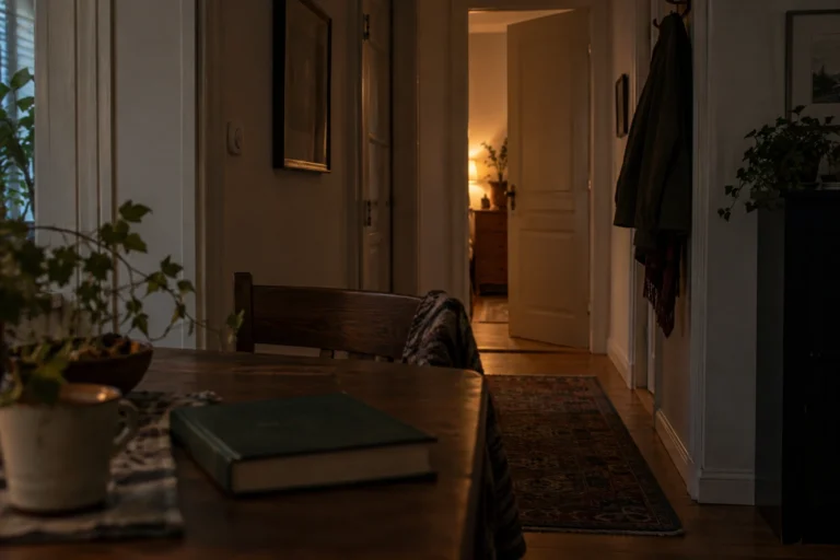
An ordinary room can become surprisingly unfamiliar after dark. During the day, I can see its edges, its furniture, and whatever is…
 October 25, 2026
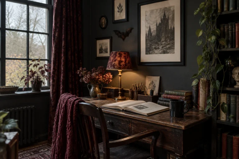
When I imagine a gothic reading corner, I think about somewhere I would genuinely want to spend an evening. A comfortable chair,…
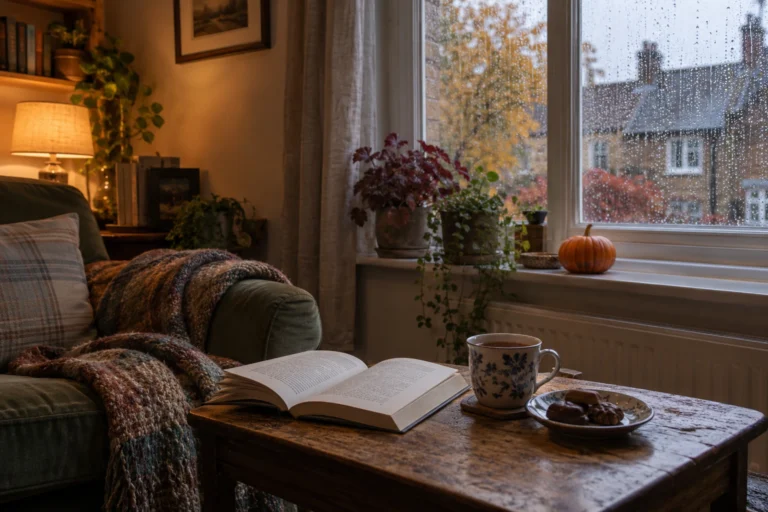 October 25, 2026
There is a version of Halloween I like that involves very little preparation. A comfortable room, something good to read, a warm…
 October 20, 2026
One of the first things new authors encounter when preparing a book for publication is the ISBN. It appears on printed books,…
 October 20, 2026
Choosing the right book title can be surprisingly difficult. A title needs to fit the story, appeal to potential readers and remain…
 October 20, 2026
Finishing a manuscript can take months or years, so receiving an offer from a publisher is understandably exciting. Somebody wants to publish…
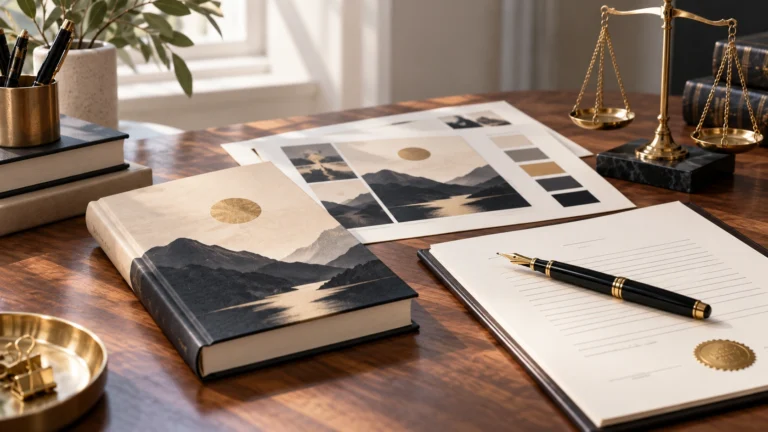 October 20, 2026
A book cover is one of the first things a potential reader notices. Before somebody reads the description or opens the first…
 October 20, 2026
There are plenty of reasons why an author might prefer publishing under a different name. Some want privacy, others want a name…
 October 9, 2026
One thing I have never liked about social media is that having followers does not necessarily mean being able to reach those…
October 25, 2026A reading night for two sounds like a good Halloween plan to me because it leaves room for both company and quiet.…
October 25, 2026An ordinary room can become surprisingly unfamiliar after dark. During the day, I can see its edges, its furniture, and whatever is…
October 25, 2026When I imagine a gothic reading corner, I think about somewhere I would genuinely want to spend an evening. A comfortable chair,…
October 25, 2026There is a version of Halloween I like that involves very little preparation. A comfortable room, something good to read, a warm…
October 20, 2026One of the first things new authors encounter when preparing a book for publication is the ISBN. It appears on printed books,…
October 20, 2026Choosing the right book title can be surprisingly difficult. A title needs to fit the story, appeal to potential readers and remain…
October 20, 2026Finishing a manuscript can take months or years, so receiving an offer from a publisher is understandably exciting. Somebody wants to publish…
October 20, 2026A book cover is one of the first things a potential reader notices. Before somebody reads the description or opens the first…
October 20, 2026There are plenty of reasons why an author might prefer publishing under a different name. Some want privacy, others want a name…
October 9, 2026One thing I have never liked about social media is that having followers does not necessarily mean being able to reach those…

Add the M.V. Mitic app to your device and start reading.